The
Association of Illustrators website
After looking at all three websites i have decided that the one i
like the most is The Association of Illustrators website. I also like the fact
that its a not-for-profit trade
organisation, dedicated to its members which is very important to me
as I’m all about the not for profit organisation, as I feel this
shows the people who run it have a passion for illustration and fingers
crossed wont rip the people off who use they services. I feel like the website is
a lot easier to use compared to the other two and the content is very appealing
with a lot of other practitioners work ready and available to look at with
links to their websites.

PART 2
Product
1. Packaging
2.Skateboard Decks
3.Cereal Boxes
4. Album Covers
5.Clothing
6.Stickers
7.Greeting Cards
8.Drinks Pakaging
9.Video Games
10. Graphic Novels
Publication
1.Childrens Books
2.Music Magazines
3.Text Books
4.Manuals
5.Book Covers
6.Leflets
7.Buisness Cards
8.Posters
9.Flyers
10. Front Magazine
Place
1.Exibitions
2.Billboards
3.Book Shops
4.Art Shops
5.Bus stops
6.Train Stations
7.People
8.Street Signs
9.Art Gallery
10. Museums
Online
1.Portfolios
2.Artist websites
3.Advertisements (everywhere)
4.Google
5.Emoticons
7.Online Books
8. The assionaions of Illustrators Website
9.Blogs
10.Online shops
PART 3

Product
Skateboard decks
Album art work
Drinks Packaging

Clothing by RSI apparel


Publication
Flyer - Mr Scruff

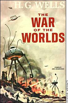
Bookcover
Poster - Godmachine

Front Magazine

Place
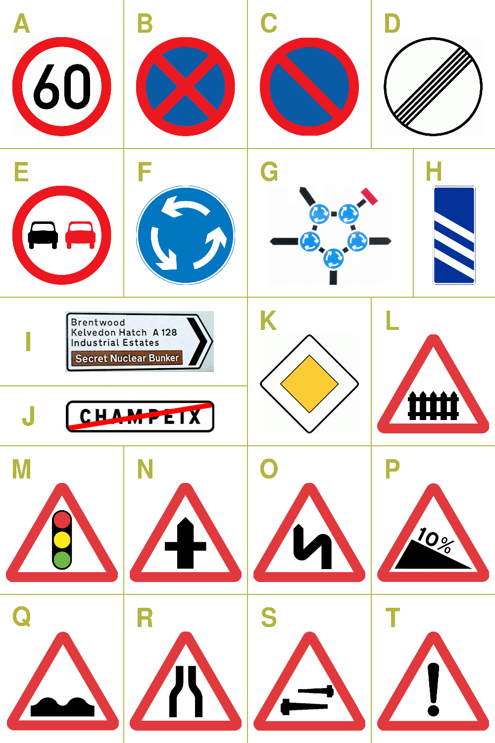
Road Signs
Art Gallery

Book Shop

Online
Online Portfolios


Emoticons

PART 4
I feel that skateboard graphics play a massive part in my own practise as i have always been in ore of them and its always been my dream to produce them, seen as i was never that good at skateboarding itself that i could do the graphics for them and continue to be part of the industry. It is one of the few areas in art/graphics/illustration thats still open to individuals that don't fit the mould of mainstream boringness.
Producing poster is a great and cheapish way to get your work out and about in the world. You can either produce them for your own work or you can adapt your work to be for a event, brand, gig many different opinions come. As they are not the most expensive product to be produced it could be a starting point to start releasing work.
Book shops a great place to go and see what is been put out and about by other creatives and a source for great inspiration full of amazing stories waiting to be discovered.
After doing this task (part 1) I have discovered one of the best online places to check out and research professional illustrators and they bodies of work. This section of The Association of Illustrators (AOI) is where i have dicovered a few new illustrators and works that motivate me to crack on with my own practise and keep the ball rolling to further progress myself to a higher standard to one day hopefully be able o join such a community and display my work.
1. Packaging
2.Skateboard Decks
3.Cereal Boxes
4. Album Covers
5.Clothing
6.Stickers
7.Greeting Cards
8.Drinks Pakaging
9.Video Games
10. Graphic Novels
Publication
1.Childrens Books
2.Music Magazines
3.Text Books
4.Manuals
5.Book Covers
6.Leflets
7.Buisness Cards
8.Posters
9.Flyers
10. Front Magazine
Place
1.Exibitions
2.Billboards
3.Book Shops
4.Art Shops
5.Bus stops
6.Train Stations
7.People
8.Street Signs
9.Art Gallery
10. Museums
Online
1.Portfolios
2.Artist websites
3.Advertisements (everywhere)
4.Google
5.Emoticons
7.Online Books
8. The assionaions of Illustrators Website
9.Blogs
10.Online shops
PART 3
Product
Skateboard decks
Album art work
Drinks Packaging
Clothing by RSI apparel
Publication
Flyer - Mr Scruff
Bookcover
Poster - Godmachine
Front Magazine
Place
Road Signs
Art Gallery
Book Shop
Online
Online Portfolios
Emoticons
PART 4
I feel that skateboard graphics play a massive part in my own practise as i have always been in ore of them and its always been my dream to produce them, seen as i was never that good at skateboarding itself that i could do the graphics for them and continue to be part of the industry. It is one of the few areas in art/graphics/illustration thats still open to individuals that don't fit the mould of mainstream boringness.
Producing poster is a great and cheapish way to get your work out and about in the world. You can either produce them for your own work or you can adapt your work to be for a event, brand, gig many different opinions come. As they are not the most expensive product to be produced it could be a starting point to start releasing work.
Book shops a great place to go and see what is been put out and about by other creatives and a source for great inspiration full of amazing stories waiting to be discovered.
After doing this task (part 1) I have discovered one of the best online places to check out and research professional illustrators and they bodies of work. This section of The Association of Illustrators (AOI) is where i have dicovered a few new illustrators and works that motivate me to crack on with my own practise and keep the ball rolling to further progress myself to a higher standard to one day hopefully be able o join such a community and display my work.


