My Pintrest account is : http://uk.pinterest.com/livrid/
Craft
how well something has been created.
http://www.murraymitchell.com/2013/05/pigeon-dissection-illustration/
i really like this image as i feel it has a great quality in the approach its been done in. Keeping the head and face gives a friendly look and the detail of its inners just works really well. It dosent look like your normal dissection image
COLOUR
Looking at how colour can be used to make a image stand out and work in harmony with each other.
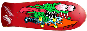
By Jim Phillips for Santa Cruz.
Media
What media and process can be used to create and give different effects and feelings to work.
http://siscottstudio.com/projects/dove-origin-68/
This image is by Si Scott a ill ustrator who creates great illustrations and imagery using pen and ink. I have chosen this image as it reflects how soft ink can make a image look.
Quality of Line
This is a image of Rat FINK by ed 'BIG DADDY" roth, but it has been reproduced on to these bowling pins by Gav Black.
LAYOUT/COMPASSION
this poster by Godmachine has a good layout and i also like the way the lilies poke out over the borders edge, skillfully done.
Sunday 30 November 2014
Sunday 16 November 2014
OUIL403 Evaluation
1. Which practical
skills and methodologies have you developed within this module and how
effectively do you think you are employing them within your own practice?
|
I now do a lot more development work using roughs
and scamps before I decide on a final design I’m going to work on, taking in
to consideration colour layout, medium and fonts.
Working in the different mediums in the development
stage can help me to see which one will better suit the style on the work I’m
producing and I feel this gives added practise using the different materials,
therefore building my confidence when using them on designs. Also once I find
an image I’m happy with I can then work on it in different ways to see which
best works, this helps me explore the different ways this image will look
from the start of the final design.
|
2. Which principles/ theories of image making have
you found most valuable during this module and how effectively do you think
you are employing these within your own practice?
|
I have used reference material to get my ideas and
shapes down on paper to then add and build on top of. Just doing a quick
search on the internet or looking in a book can save heaps of time not having
to try work out how something looks from memory as it is then in front of
you.
Scanning or taking photos of my images then editing
them in Photoshop to play with colour schemes allows me to see which works best
before adding any colour to my final designs. This also saves time and the
results are instant with no waste.
|
3. What strengths can you identify within your submission
and how have you capitalised on these?
|
I found that whilst working on the day in the life brief I really enjoyed
the task of working to a story/article as it didn’t give too much of a
platform to go wild with random ideas. Although that would have been nice it
made me do the obvious and this seemed to work, working on similar designs
just with little alterations gave me a greater idea of how the final images were
going to look and work together as a series. I also used images to reference
from to help me illustrate my ideas better and give them a more life like
look.
|
4. What areas for further development can you
identify within your submission and how will you address these in the future?
|
When drawing up my roughs and scamps I need to
start drawing them in the layout of the size the final image will be applied
to so I can better see how the finale design is going to look in the correct
format. I could do this b drawing a box using the shape of final designs
formats and work to those limitations.
I feel I need to work on the layout and composition
of my designs, as it seems to be something I have never really thought about
before this unit. I need to try and work out how best the imagery is going to
look and work out if the images and
text are balanced right with the amount of negative space left
|
5. In what way has this module introduced you to
the Ba (Hons) Illustration programme?
It has been great starting point as I feel I now
have a sense as to what the program is about and what time scale we have to
do the different aspects of development to the final design. As well as
getting an idea of what I am expected to produce in order to make the next
steps not as challenging, leaving more time to perfect my ideas.
The only issue I had is putting my work on the blog
as it is a whole new system of working for me which at times can be
frustrating and time consuming.
|
Wednesday 12 November 2014
Jim Phillips
Artist: Jim Phillips
I am a massive fan of Jim Phillips art work as i have spent many hours looking at images of skateboard decks, surf art and for me Jims work always stands out head over heels from all the thousands of images out there. He has his own tone of voice that is instantly recognisable.
This image of him in his studio is what motivates me to continue with my own practice as one day i would love to own a studio space covered in all my creations just like his here.
Bold central graphics that have a big impact and you would be gutted when skating this board if you was to scuff it up and ruin it, more form over function.
Subscribe to:
Posts (Atom)