OUIL 602 PPP
Personal and Professional Aims
My aim is become a freelance creative practitioner within the alternative scene.
Set up a brand provide steady income
- Clothing brand based on own illustrative drawings
- Also selling other types of merchandise
- Ideally leading to turning this into a collaborative bringing in other creative people to work all side
Commissioned pieces in order build reputation, less secure but larger revenue
Collaborations with
- Other illustrators
- Skate board companies
- Music and bands
- Local companies
- Alternative sports
Continually update portfolio on variety of Platforms
Skills and areas to develop
Skill/area How Time frame
Portfolio to showcase professional work Speak to other illustrators about the best way to go about starting first professional portfolio
Research other illustrators portfolios on AOI online
Develop new ideas to showcase using a range of styles
Work on developing an end/finished image
Creating an end product to a professional level within time frames Work on time management skills, planning out time frames better
Create a t-shirt a month in order to practice these skills
Need funds in place to
Screen printing Set up home studio
Book some time in university studios
Produce both paper and fabric products
Research into material use
Photo shop – advance learning from basic skills to more complex skills Try to use Photoshop every day to perfect current skills
Watch online tutorials in order learn about new parts of the programme
Learn from the IT support at university
Try to use a graphics tablet to see if this expands learning
Networking with other agencies, illustrators and creative practitioners Contact other via email
Work on collaborations
Research into networking events and go
Target areas I am interested in
Improve online presence and promotion
Attended conventions and shows
Research into how collectives work
Proposal of Self-Promotional Materials
Business cards
- Hand screen printed
- Individual designs
- Different designs tailored to different genres/areas of illustration
- To help promote work but also showcase different designs
Stickers
- Sticker packs
Various merchandise through use of sites such awesome merchandise
- Rubbers
- Car air fresheners
- Badges
- Fridge magnets
- Lighters
Online
- Eflyers
- Online giveaways
- Website
Sample packs
Friday 11 November 2016
Monday 7 November 2016
Companies/People to contact
Send some questions to these guys.
Keep the emails little a few question not over the top.
Jonny Cupcakes.
http://johnnycupcakes.com/
email from websight, try find his personal account.
http://support.johnnycupcakes.com/customer/portal/emails/new
Mike Magnolan.
http://artofmikemignola.com/connect
Emailed him asking about the resale of Hellboy at thought bubble
Abandon Ship Appeal
Emailed and got a response from Rich Davis the guy who owns and runs the company.
RSI appeal
Artist from thought bubble
(use business cards collected)
Prints Of Thieves
Jaspa Lee -
Say john told me to connect him ask him how he got started. Ask him who else i should be talking too in the industry. How he got started.
David Humphries ???
Helen Barbour- John will try make contact. BARBOUR
Disobia Clothing, About artist selection and how they got started in the industry.
Keep the emails little a few question not over the top.
Jonny Cupcakes.
http://johnnycupcakes.com/
email from websight, try find his personal account.
http://support.johnnycupcakes.com/customer/portal/emails/new
Mike Magnolan.
http://artofmikemignola.com/connect
Emailed him asking about the resale of Hellboy at thought bubble
Abandon Ship Appeal
Emailed and got a response from Rich Davis the guy who owns and runs the company.
RSI appeal
Artist from thought bubble
(use business cards collected)
Prints Of Thieves
e: info@printsofthieves.co.uk
Jaspa Lee -
Say john told me to connect him ask him how he got started. Ask him who else i should be talking too in the industry. How he got started.
David Humphries ???
Helen Barbour- John will try make contact. BARBOUR
Disobia Clothing, About artist selection and how they got started in the industry.
- IF your product is bad you wont sell
- Just try get feedback if I can from them.
- Look up and research brands
thought bubble 2016
I spoke to each artist i bought something off at the festival asking them about they process and how they are using digital process and analog together to create they items they had on sale. It was good to hear that most of them now use photoshop in some way in they creative process, be it to help add the coulor or to build up a image nto its final piece


Sunday 16 October 2016
Articles on how to start taking over the world, with a brand.
5 Steps to Build a Creative Business from Scratch
https://www.entrepreneur.com/article/231560Observe, Brand, Produce, Plan, Connect.
Wednesday 12 October 2016
Companys and websites
Longfox
http://longfox.bigcartel.com/
http://longfox.bigcartel.com/
This is Barbie Lowenberg and Iain Sellar a company/collective i have been following for a few years now. I like the products they put out as they are mostly in black and white with nice crafted line work and strong images. 
Abandon Ship Apparel
https://www.abandonshipapparel.com/

I have been following this company on social media since they started out. Over the years i have loved what they have with they brand. They have worked with some of my favorite artist/illustrators such as Hydro74, Mcabees, Iain Seller and Tom J Newell. I really like the designs that they put on garments and I own a few of they products. The bold use of image on they t-shirt and the fact that they use just black and white on most of the shirts is what appeals to me, they do use color in some of they designs but its the B+W foor me. Also they seem to produce what they want to be produce and don't always go chasing the recent trends.
They have always been very active in using social media to interact with the customers, this gives they direct feedback and contact from the people who buy they product new product. This is something I have watched and seen that direct contact with customers gives your company a voice that people feel they can interact with.
Death Hell Grave http://deathhellgrave.bigcartel.com/
This guy has been on my browser for a while too, his t-shirt and patch products are my thing from him. He uses a lot of skulls in his work which is a must for me in a product but not just a sandard skull one with the artist's own twist on.
Some of his Embroidered patches.


Impericon
Ihttp://www.impericon.com/uk/
This company seem to be a the big dog in the alternative music industry when it comes to merchandise. I have seen them introduce bands that are very talented and have already got a bit of a buzz around they merch and then help them rocket to success using they merch as a great advertising tool. When i attend Download Festival they seem to be the ones with the biggest marquee and the most amount of garments for sale.


www.disturbia.co.uk
Disturbia are an alternative merchandise company who have been producing clothing for Goths and metal heads for a number of years. They bring in artist like Godmachine to produsse work for them to be added to t-shirts and jumpers. They focus or both Women and Mens clothing with illustrations of dark creatures and symbols often associated to alternative faith leaders.

Abandon Ship Apparel
https://www.abandonshipapparel.com/
I have been following this company on social media since they started out. Over the years i have loved what they have with they brand. They have worked with some of my favorite artist/illustrators such as Hydro74, Mcabees, Iain Seller and Tom J Newell. I really like the designs that they put on garments and I own a few of they products. The bold use of image on they t-shirt and the fact that they use just black and white on most of the shirts is what appeals to me, they do use color in some of they designs but its the B+W foor me. Also they seem to produce what they want to be produce and don't always go chasing the recent trends.
They have always been very active in using social media to interact with the customers, this gives they direct feedback and contact from the people who buy they product new product. This is something I have watched and seen that direct contact with customers gives your company a voice that people feel they can interact with.
Death Hell Grave http://deathhellgrave.bigcartel.com/
This guy has been on my browser for a while too, his t-shirt and patch products are my thing from him. He uses a lot of skulls in his work which is a must for me in a product but not just a sandard skull one with the artist's own twist on.
Some of his Embroidered patches.
Impericon
Ihttp://www.impericon.com/uk/
This company seem to be a the big dog in the alternative music industry when it comes to merchandise. I have seen them introduce bands that are very talented and have already got a bit of a buzz around they merch and then help them rocket to success using they merch as a great advertising tool. When i attend Download Festival they seem to be the ones with the biggest marquee and the most amount of garments for sale.
www.disturbia.co.uk
Disturbia are an alternative merchandise company who have been producing clothing for Goths and metal heads for a number of years. They bring in artist like Godmachine to produsse work for them to be added to t-shirts and jumpers. They focus or both Women and Mens clothing with illustrations of dark creatures and symbols often associated to alternative faith leaders.

Sunday 9 October 2016
Collectives
Looking round at what collectives get up to and producys the make and how the operate. These are collectives that I like and the work they produces.
www.zerofriends.com
www.dudes-factory.com
www.puckcollective.co.uk
www.longfox.bigcartel.com
Looking round at what collectives get up to and producys the make and how the operate. These are collectives that I like and the work they produces.
www.zerofriends.com
www.dudes-factory.com
www.puckcollective.co.uk
www.longfox.bigcartel.com
Friday 16 September 2016
Summer Sketchbook pt3
Done using Fineliners, Isograph, Markers, Watercolors, Acrylic paint all in moleskine sketchbook or pieces of card
.
.
Thursday 4 August 2016
OUIL502 Resubmission Part 2
With my own practice I’m starting to see where I want to go
and where I need development in my work. I have recognised that I need to use
my interest in helping me develop my practice as this feeds into my passion and
therefore my motivation to create art. Take for example my love for music and
the areas of the genre’s I love, using this I have started to look at band and
gig posters and merchandise and seen that with more development in the printing
and distribution I will hopefully be able to produce a brand that I can aim at
this market. This I can then use as a platform to promote my name and my brand
to the wider industry, producing artwork that becomes known for complimenting their
music. At the moment I’m drawing and studying the metal industry’s art and considering
what is being produced and how it is being used. Examples include designs for
album covers and clothing merchandise.
In the short/medium term I want to develop a body of work
showing my designs for my brand Livrid. Building up a website with a web store
where I can sell my garments and art. This will also be a place I can have my
online portfolio and a body of work to promote my skills to others and have the
necessary details added to get people in contact with myself about a design or
idea they have. I have also used the designs from my OUIL503 work by contacting
the bands I produced them for in order to get some constructive feedback. In
return I was offered very positive feedback, including a potential sale on one
of the designs to be used on a single launch.
To get the brand going I first need to get some logo
designs, illustrations for t-shirts, business cards, and a brand logo,
basically get the branding finished up and feeling like it works well along
side my designs and where I am want to take the brand. I’m currently in the process of converting
one of my sheds into a studio space where I can get my screen-printing
equipment back into use and have a space I can develop an idea from sketchbook to
final printed t-shirt as quick as I can to see if it works. With getting my
printing equipment out and using the knowledge I have picked up in the print
studios I feel I now also have the confidence to start printing onto paper and
produce screen-prints of my work to sell. By doing all of this myself I know
I’m going to cut out the cost of a third party company printing it for me. The
cost to get set back up with cleaning chemicals, inks, adhesives, some new and
retrenched screens, and some wholesale t-shirts and papers will be the biggest
cost for the foreseeable future but this cost is a long term investment which
will soon be covered. In order to build these funds I will be doing smaller
commissioned designs.
I’m happy with the progress and skills I have picked up this
year, one of the main ones is being able to try enjoy each piece of work I am
working on, if its not fun and becoming a chore then I’m doing something wrong.
This year I have had a battle with my illustration work and found myself not
enjoying the processes or the end product and ultimately this is not what I
have come to university to do, it’s the opposite. I found I was being far too clinical at every
stage of my work, which was often stunting my creativity and fluidness to
produce something unique. I have
discovered that I should not do this and instead save it until after the
development stage so I can be more free and spontaneous in what I produce. This
will then lead to a better image and a change in the subject in drawing and a
varity to choose from. I have started to pay a significant amount of my
attention to the marks I can make with my pens, and by building up an array of
skills using one tool such as my drawing pens I can learn and use multiple
effects to build up an image. Using dots to build up an image has been the
biggest surprise to me as I found it’s a process that works for me and seems to
best translate what I’m trying to draw.
There are a few areas I feel I could do with improving the
main one is the final stages of my work. I spend a long time producing work in time-consuming
techniques.
I have been working on skull designs for the past few months
and whilst development has been tough I am starting to get to stage I’m happy
with the design I have developed. Though consistent development and just
drawing similar images repeatedly I have found comfort now in where I am taking
these designs and can see them been printed on products such as t-shirts, I
have started to see how development though drawing can improve and evolve a
design to a stage I’m happy with. For myself there is an element of building my
confidence up in my own work in order to help me progress further at present
this sometimes presents a weakness in my work and my ability to complete
designs to time schedules. The repetitiveness and building on designs however
can act as a positive as it gives unanticipated results some times and a chance
to play and tweak the design in any way I want. I know skulls have been often
been overused throughout history and heavily in the alternative music scene but
it’s where my development is taking me and to progress to produce skulls to a
standard that will make them stand out from the rest. At the stage I am at in the development I am
now happy to start to add my designs to products and show them off. At the
moment I am adding one of my sketchbook drawings in much larger format onto a
surf board, this is teaching me a great deal in how to recreate a image on to a
larger surface and how the techniques I am using respond to this bigger format.
At present I need to continue researching into how to become
more involved in music industry design and establish if this is a financially
viable way forward. Continuing to look at different markets to see if my style
can fit into different genres and types of illustration. Alongside this also
researching smaller independent design companies’ history and progression to
see how I can direct my own brand down a similar route. This may include
widening my networking.
Finally researching further into the cost and implications
of printing own work and studying how I can strengthen these skills in order to
create products that are going to stand out in the market. I am also interested
in looking into how to make products that are more eco friendly; this
particular area has become more popular over the past few years with a focus on
handmade products that are environmentally friendly and fits with my own moral
stance. For example researching into how to make produced from recycled
materials.
Tuesday 2 August 2016
OUIL502 Resubmission PART 1
Robert Borbas AKA Grind Design www.theartofgrindesign.com/home.html is a illustrator from Buderpest, he has work with so many bands and companys ima fan of I could not possabley name them all. He has a similar working set up as i do as he does 70% of his drawings by hand then takes it to photoshop to colour and finish of his designs. He creates work with a dark gothic style with added gore. He has also taken his attention to detail and sharpe images to the tattoo world and he has created some mighty fine work. Along with this he also own a clothing brand Fvernal Apparel, this is where i have a keen interest in seeing how his illustration translate onto clothing. Looking at how the positions and layout of his designs work on garments too.
I have started to study his work in a bit more detail trying to pick up how he adds shades and tones to his end products as i want to try achieve the level of depth he creates in his images. From looking through his gallery on his website i have started to notice the use of textures he has added to make objects this gives the objects the illusion of how they could feel.. He he is a heavy skull user in his work added bonus.
 Death Hell Grave http://deathhellgrave.bigcartel.com/. This guy has been on my browser for a while too, his t-shirt and patch products have had my attenion for some time now. He uses a lot of skulls in his work which is a must for me in a product but not just a standard skull one with the artist's own twist on. I would too like to have go at making patches for my brand LIVRID and from looking at DHGs work I can see how my illustration could be made into patches. As i use heavy outlines and bold colours i feel i could turn some of my already finished designs to patches almost straight away.
Some of his Embroidered patches.
Abandon Ship Apparel
https://www.abandonshipapparel.com/
They have always been very active in using social media to interact with the customers, this gives they direct feedback and contact from the people who buy they product new product. This is something I have watched and seen that direct contact with customers gives your company a voice that people feel they can interact with.


45RPM www.thebearded45.co.uk , www.45rpm.bigcartel.com I first found 45rpm by seeing his graffity but then i found his other work which he post alot to on his instagram account. He illustrates quotes and sayings, his style is so consistent which bold clean thick outlines coloured in flat colour. His images even tho simple in constructions have movement and a very good quality when finished. They stand out by how crisp and well constructed the line quality is . This translates as images that are great when applied to merchandise such as pin badges, embroidered patches, stickers and printed on clothing. This is again the kind of images i want to be producing as i also like to use bold outlines and want to understand how to use simple well thought out flat colours to enhance the over all look of my images be it a spot illustration, logo design or character design. By looking and seeing how people like 45rpm use colour should show me simple schemes that work to great effect when used together which bold outlines.


I have started to study his work in a bit more detail trying to pick up how he adds shades and tones to his end products as i want to try achieve the level of depth he creates in his images. From looking through his gallery on his website i have started to notice the use of textures he has added to make objects this gives the objects the illusion of how they could feel.. He he is a heavy skull user in his work added bonus.

Some of his Embroidered patches.
Abandon Ship Apparel
https://www.abandonshipapparel.com/
I have been following this company on social media since they started out. Over the years i have loved what they have with they brand. They have worked with some of my favorite artist/illustrators such as Hydro74, Mcabees, Iain Seller and Tom J Newell. I really like the designs that they put on garments and I own a few of they products. The bold use of image on they t-shirt and the fact that they use just black and white on most of the shirts is what appeals to me, they do use color in some of they designs but its the B+W foor me. .
They have always been very active in using social media to interact with the customers, this gives they direct feedback and contact from the people who buy they product new product. This is something I have watched and seen that direct contact with customers gives your company a voice that people feel they can interact with.

Sam Mills AKA DEFAME defameart.bigcartel.com/ creates images that are heavily influenced by demons, skulls and the dark arts side. One of the main reasons this guy is one of my favorite current artist is his use of Black and white in his images he creates. This is a area i am trying to develop myself at present. Its not that i don't like using colour i just want to be able to create garment designs that i can take from sketch to screen print with minimal editing needed on the computer, this will also keep cost down when i come to printing products as less colours means asda price (cheaper).

Tom J Newell tomjnewell.com. Line quality is a main focal point of Toms work and what i really like about the images he creates. How he takes his work and puts in on so many different formats and uses. He applies his work to many different products from record covers to hand painting shop fronts, his style seems to suit these many different uses. His used of limited again jumps out at me, his bold uses of the negative space with the space boldness for the subject does not need to be over coloured, not that he doesn't use color when he does its only really a few bold colors used to help the image jump out at you eye.

45RPM www.thebearded45.co.uk , www.45rpm.bigcartel.com I first found 45rpm by seeing his graffity but then i found his other work which he post alot to on his instagram account. He illustrates quotes and sayings, his style is so consistent which bold clean thick outlines coloured in flat colour. His images even tho simple in constructions have movement and a very good quality when finished. They stand out by how crisp and well constructed the line quality is . This translates as images that are great when applied to merchandise such as pin badges, embroidered patches, stickers and printed on clothing. This is again the kind of images i want to be producing as i also like to use bold outlines and want to understand how to use simple well thought out flat colours to enhance the over all look of my images be it a spot illustration, logo design or character design. By looking and seeing how people like 45rpm use colour should show me simple schemes that work to great effect when used together which bold outlines.

Sin Eater Illustrations sineater.bigcartel.com is a illustrator that has such detail with so much line quality in each mark he makes. These marks also help with direction and flow to the images for example on the fur of a beast he changes the direction of the makes to show the fur flowing over the contours of the body, this also helps with the depth of the image. He has a style reminds me of very old school gothic images that would be found in books showing images to help explain the text. From Sin Eater the added bonus of adding direction can help add movement to a image even down to the tiny marks he make. Also one of the main the main aspects from his practise is that you can screen print fine detail very well, as this is something people keep asking me about the recent detailed work iv been exploring is will the fine detail translate through the process.

Kerby Rosanes is a artist i was introduced to via a gift someone sent us in the form of a book called sketchy stories, i have become a big fan of Kerby's from receiving this book. It is full of his sketches and process he has when making work, but the most amazing part is the vision he has for turning a image into a journey which is full of so much information. He calls his sketch books his doodle world as he can create whatever he want on every page create world, monster, creatures of all shapes and sizes, he creates palaces out of shells been flaunted by a snail, the man is gifted. From Kerby Rosanes the importance of sketching, doodling everyday getting your imagination out of your head on to paper keep the strange ideas flowing and build up a world for my own for myself.

Matt Suanders www.mattsaunders.ink Is a illustrator from leeds but now based in london town. I have followed matts work for many years and have seen him over the last few years take hold of his tone of voice and apply it to a number of different products. Matt has recently been doing gig posters for Modest Mouse working on illustrations for J.K Rowlings Pottermore. Matt also puts out his own personal work that he sells though his s osial media pages which he keeps up to date all the time with what he is woking on and to show his new work off.

Tim Burton www.timburton.com One of the biggest inspiraion to me is Tim I have grown up watching all his films and looking at his art work and illustraion. I feel it can be said tim burton has created a whole world from his own head. I love the character work he does be it for a film and book or a short storey. Some of the characters he has created such as Jack skellington who was created for The Nightmare Before Christmas animated film nearly 22 years ago have become mega stars of the merchandise world and has been used many times still to this day. I love his book The Melancholy Death Of Oyster Boy and Other Stories its full of wonderful short wth spot illustration to support and give a visual on each peace of writing. He is also the creator of the best film in the history of film to ever be made MARS ATTACKS is my all time favorite film, lord Burton dint come up with the original idea of mars attacks as it was originally a trading card series by topps, but he certainly put his magic touch to it and made it gold. As Tim has so many designs and a world of his characters set in his own worlds he must not stop drawing and creating all the time and thats what im currently doing just drawing or creating something or developing a idea everyday and trying to stay within the creative bubble, finding my own creative world.


Tuesday 19 July 2016
2nd summer sketchbook work.
Iv been away in malta for a week and took my sketchbook to get the creativeness flowing with plenty of vitamin D to help. Also I have included the Anniversary I made for my loverly wife for our first wedding anniverary as it was our first this is ment to be done with paper so Hannah got me a moleskine sketchbook which most of these have been drawn/doodled/sketch in. I have to say it has nice paper.
Saturday 25 June 2016
Summer sketchbook work 2016
SO a bit slow getting started posting my continuous sketchbook work tough out the summer break. I had a few weeks where i drew alot i just dint produce loads of work. here is some of the work iv been playing around with and new ideas i'm starting.
One of the first things i did was go to the World super bike and this made me want to see if i could mock up graphics for superbikes. After spending some time on photoshop placing one of my skull drawing over a image of a MV Augustus (very good looking race bike, my favourite) and trimming and erasing bits here and there i realised the shape of the fearints and all the in dents and concurves was a nightmare. So I am looking at trying to create a blank flat template of the fearing to see if that would work.
Also a design for my brand i'm hopefully going to start up again very soon just waiting to here if i have some investment to help me out.
And random doodles and photoshop practise.
Monday 20 June 2016
Bands and they merchandise
While She Sleeps
whileshesleeps.com
This band has done something that i have not seen a band do before and that's to come up with a logo for the band that is so successful it its own right. I have in the past seen people in the merch and gone to talk to them about the band and to my surprise they guy had no idea who the band was he just thought it was a brand of clothing, the band have been accused of been a brand over a band but thats just jealous nonsense.


Parkway Drive
http://uk.kingsroadmerch.com/parkway-drive/?id=1111


Cancer Bats
http://www.cancerbats.com/
I am the proud owner of these two t shirts.


Gallows
Again here these are all the products i purchased from this band. To say the original line up was my all time favorite shows iv ever attended (I have been to hundred and hundreds of concert), i traveled up and down the country to see this band perform.


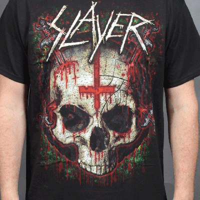
Slayer
I love this band and they merchandise they use images that are very close to offending people of faith.,the use a image that could be very easily be understood to be a character of a belief. The use of satanic symbols to provoke a reaction and it seems to work and sells.. I do only have a embroidered patch of this band i use to have a t shirt but it grow legs and left me. It is the patches that this band sell that really interest me. No matter what event you go to where metal heads will be in attendance you are pretty much 100% guaranteed to see oa slayer patch on someones denim waist coat.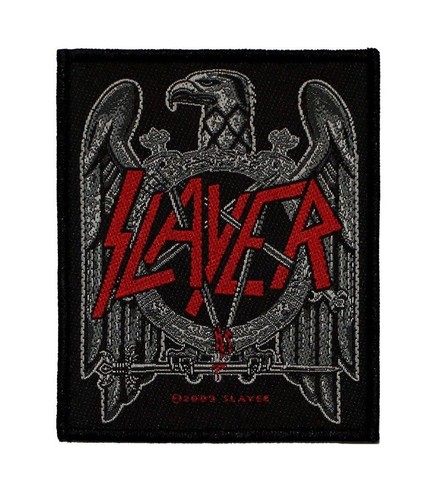


A Day To Remember
I first found this band through the artwork that Dan Mumford designed for them for their second album Homesick.


They also seemed to take over the band merch market at one point with their fans buying so much or their tshirts down to the bight vibrant design and colours used. It was audience mainly of their younger fans who wore the merchandise but their had so many designs out and most of them where really well done and very very eye catching.
ADD ISSUUE VIEW THING HERE
whileshesleeps.com
This band has done something that i have not seen a band do before and that's to come up with a logo for the band that is so successful it its own right. I have in the past seen people in the merch and gone to talk to them about the band and to my surprise they guy had no idea who the band was he just thought it was a brand of clothing, the band have been accused of been a brand over a band but thats just jealous nonsense.


Parkway Drive
http://uk.kingsroadmerch.com/parkway-drive/?id=1111
Cancer Bats
http://www.cancerbats.com/
I am the proud owner of these two t shirts.
Gallows
Again here these are all the products i purchased from this band. To say the original line up was my all time favorite shows iv ever attended (I have been to hundred and hundreds of concert), i traveled up and down the country to see this band perform.
Slayer
I love this band and they merchandise they use images that are very close to offending people of faith.,the use a image that could be very easily be understood to be a character of a belief. The use of satanic symbols to provoke a reaction and it seems to work and sells.. I do only have a embroidered patch of this band i use to have a t shirt but it grow legs and left me. It is the patches that this band sell that really interest me. No matter what event you go to where metal heads will be in attendance you are pretty much 100% guaranteed to see oa slayer patch on someones denim waist coat.
A Day To Remember
I first found this band through the artwork that Dan Mumford designed for them for their second album Homesick.


ADD ISSUUE VIEW THING HERE
Sunday 15 May 2016
Creative CV

I have just kept my CV straightforward as it feels like it shows a little about me. i have added all my on line content information so they can go on to further look at what i do. Adding a drawing I feel is better at illustrating who I am.
This drawing is a copy of a painting i did earlier this year after catching some fish mainly Tench,Carp,Rainbow trout and Roach with some real character i wanted to make one real. So using a combination of a few different fish i came up with this guy. It is mainly based on a tench as they are my favorite fish.
Here is the watercolour painting

Here's a acrylic painting at about size A0 on cotton canvas it stands outside the bathroom.

Promo stuff part 2
So i have come up with some new designs and ideas for ideas i can better improve the visual side of my brand and art work.
First off I have been working on the design and layout of my website. recently i have been introduced to Adobe Muse where you can build you own website. Iv had little time to get on and properly explore and work out how the program works yet due to workload issues, but this is something i am very keen to get on and start building my new website. The website i currently have I had no involvement in its construction, so this is something I want to address strait away as I have the domain www.livrid.co.uk up and running just with the wrong content at present.
Here are the mock ups I have been working on.
I have tryed to keep the design and content to a minimum just so i can focus on the main information and products and not give myself too much of a challenge went first trying to make a website. I feel that once i have learnt to use the software better and understand what i'm doing I can then start to improve the service my website can offer, such as collaborations, other artist i have worked with, add videos and maybe animated content.
I have just added a selection of designs mocked up t shirts the ones i am hopefully going to be printing thought the summer. These are some of my favorite designs i have done this year and i sure more will be draw and hopefully printed.
This has been a great task for me as this is where i want my practise to go down the route of making my own clothing designs printing them and selling the end product. Along with this i want to be able to go round a selection of different art fairs to sell my products. After having a stall and a successful weekend the JuJu spectacular a few years ago im very keen to do these kind of fairs again. It wa great for meeting folks who were buying my products and meeting so many different and very talented artist.
Business Cards
I have also come up with a set of new business cards that i want to screenprint myself. I do already have some business cards made but i feel its time they were updated and cleaned up as on my old ones their is a boob and this needs to be removed. So this time i have come up with a set as i want to be able to hand out different designs to people, this could also be a way of giving someone a small piece of my illustration work for free thats why i want to screen print the final copies.
Again I have kept these down to black and white so the cost and production time will be kept to a minimum.
Here are some other illustration i have done that i am still considering whether to use or not as business card and merch designs. I still need to change the contrasts and levels in photoshop to see how the will look properly.


With this sheet of logos i was trying to work out which combination would work best .

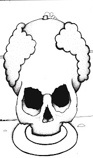
This was a skull in a plug hole, did not like the desin once i had scanned it in and played around with it.

Subscribe to:
Posts (Atom)