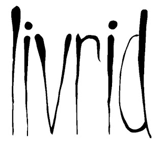
To keep my brand recognisable I have tryed to use the same LIVRID text on each design. I just kept it simple and not over complicated. I choose two one thats been vectored in Illustrator to keep the edges all nice and smooth and looking neat, and another thats a bit pixelated so it fits with some of my designs better, looks gritty and darker.


No comments:
Post a Comment